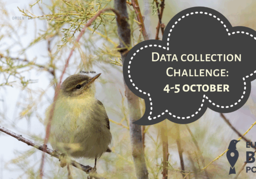
Since last year, the OpenNatureMaps databases have been enriched with a unique, renewed front page, where users can see daily data on a map. In addition, various statistics about both the database and its users have been displayed. At the same time, in order to increase users’ competitive spirit, rankings have been added to the homepage.
Some of the current innovations keep the elements of the old homepage. However, the map has been replaced by an interactive version where users can view uploaded data in four periods of their choice. Next to the map, a list facilitates the visualisation of the species and number of individuals detected in a given period. In this way, the interactive map is not only a way to consult species observed across the country. Our users can easily access species and statistics based on these observations in a particular county or even a small village. Moreover, by selecting a place and a time interval, they can also get a summary of the species observed in that period and in that area.
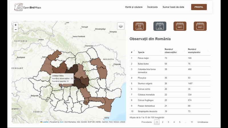
In addition to providing spatial information, we offer the possibility to visualise the distribution of data collection over time. For this, calendars have been added to the new home page. In these you can see the number of data uploaded on a given day. As with the other summary statistics, users can see the temporal distribution of their own observations and those for the whole database.
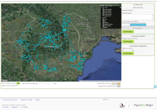
Along with the new features, we are slowly but surely approaching another milestone in the OpenBirdMaps database. Last year, we shared the news that we had reached one and a half million uploads. After a year, we can now share another round number with you, we are now approaching with full speed to 2 million data.


